Lumenite Redesign

Redesign and Rebrand for small string-light business: Lumenite

Timeline: 4-5 weeks

Role: Product Designer/Manager, UX Researcher

Objective: Responsive web redesign & rebrand for Lumenite

Tools: Figma, Maze

Lumenite Redesign

Redesign and Rebrand for small string-light business: Lumenite

Timeline: 4-5 weeks

Role: Product Designer/Manager, UX Researcher

Objective: Responsive web redesign & rebrand for Lumenite

Tools: Figma, Maze

Lumenite Redesign

Redesign and Rebrand for small string-light business: Lumenite

Timeline: 4-5 weeks

Role: Product Designer/Manager, UX Researcher

Objective: Responsive web redesign & rebrand for Lumenite

Tools: Figma, Maze

Lumenite Redesign

Redesign and Rebrand for small string-light business: Lumenite

Timeline: 4-5 weeks

Role: Product Designer/Manager, UX Researcher

Objective: Responsive web redesign & rebrand for Lumenite

Tools: Figma, Maze

Lumenite Redesign

Redesign and Rebrand for small string-light business: Lumenite

Timeline: 4-5 weeks

Role: Product Designer/Manager, UX Researcher

Objective: Responsive web redesign & rebrand for Lumenite

Tools: Figma, Maze

Overview

This project is a redesign of Lumenite, a small electronic string light company. The end goal of this redesign was a modern overhaul and rebranding to attract more user traffic to the main webpage and relaunch in the near future.


Lumenite is a locally owned specialty shop founded in November 2021 in Boston, MA. Their main products are custom light panels centered around electronic music and artists. They focus particularly on light panels of artist logos and take custom orders.

Problem

The current Lumenite website is not effectively attracting customers. Lumenite offers its products on its main page and Etsy, where the majority of its sales occur. They aim to increase sales through their official website and believe that a redesign and rebranding are necessary to achieve this goal.

Solution

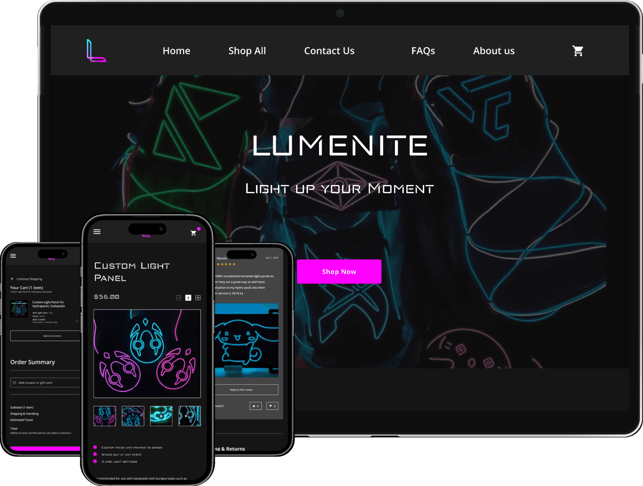
We redesigned and simplified the homepage to help users find products more efficiently. This was achieved by including helpful features, simplifying the product checkout process, and optimizing functionality, all of which enhanced the overall user experience.

My Design Process

DISCOVER

User Research, Research Findings, Competitive Analysis

User Research, Research Findings, Competitive Analysis

DISCOVER

User Research, Research Findings, Competitive Analysis

Understanding the User:

This was a client based project with constant communication with Lumenite to discuss the scope and focus of the product, their goals, objectives, as well as any key features they wanted to include for this redesign.

This was a client based project with constant communication with Lumenite to discuss the scope and focus of the product, their goals, objectives, as well as any key features they wanted to include for this redesign.

Goals

  • Improve user sale traffic through official website

  • Improve user sale traffic through official website

  • Connect more with users

  • Connect more with users

  • Smoother customer purchasing experience

  • Smoother customer purchasing experience

  • Brand modernization

  • Brand modernization

Objectives

  • Brand redesign

  • Brand redesign

  • Improve product recognition

  • Improve product recognition

Key Features

  • Logo and Banner redesign

  • Logo and Banner redesign

  • Modern Landing page

  • Modern Landing page

  • Redesigned Product page

  • Redesigned Product page

  • Smoother purchasing experience

  • Smoother purchasing experience

  • Review Section

  • Review Section

  • Customer chat/Form/etc.

  • Customer chat/Form/etc.

Competitive Analysis

We can note Lumenite’s key strength: being very a niche product with no direct competitors in its market. Considering this, we can analyze other ecommerce websites such as GloFX and iEDM as indirect competitors.

Strengths

  • Made to order products

  • Good quality

  • Large variety

Weaknesses

  • New business

  • Niche market and product

  • Requires users to already have a bag.

Opportunities

  • Niche product

  • Opportunity to be large in its own market.

IDEATION

User Research, Research Findings, Competitive Analysis

IDEATION

User Research, Research Findings, Competitive Analysis

Ideation

To visualize how to layout the webpage, we created user flows and a sitemap. With emphasis on simplicity, pages such as the FAQs and About page were removed, with the idea to include those sections on the home page to reduce the number of pages users needed to navigate through.

Personas

With the redesign of Lumenite, our target users have remained the same. As such, we want to build a deeper understanding of our users' goals, needs, experiences, and pain points. Our persona was built around the uniqueness of the product.


With the redesign of Lumenite, our target users have remained the same. As such, we want to build a deeper understanding of our users' goals, needs, experiences, and pain points. Our persona was built around the uniqueness of the product.

With the redesign of Lumenite, our target users have remained the same. As such, we want to build a deeper understanding of our users' goals, needs, experiences, and pain points. Our persona was built around the uniqueness of the product.

DESIGN

User Research, Research Findings, Competitive Analysis

DESIGN

User Research, Research Findings, Competitive Analysis

The Solution

I spoke with the client about the visuals, features and overall user pathways on what they would like to have worked on. Some highlights of the new design include the following changes:

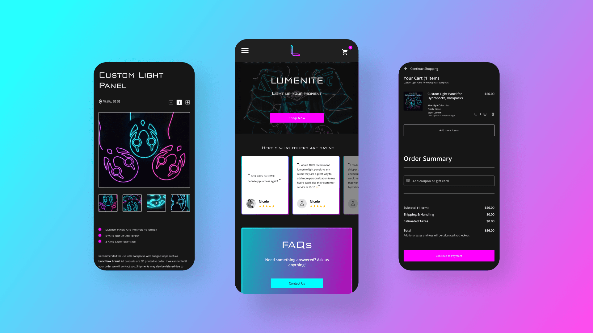
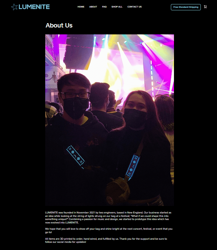
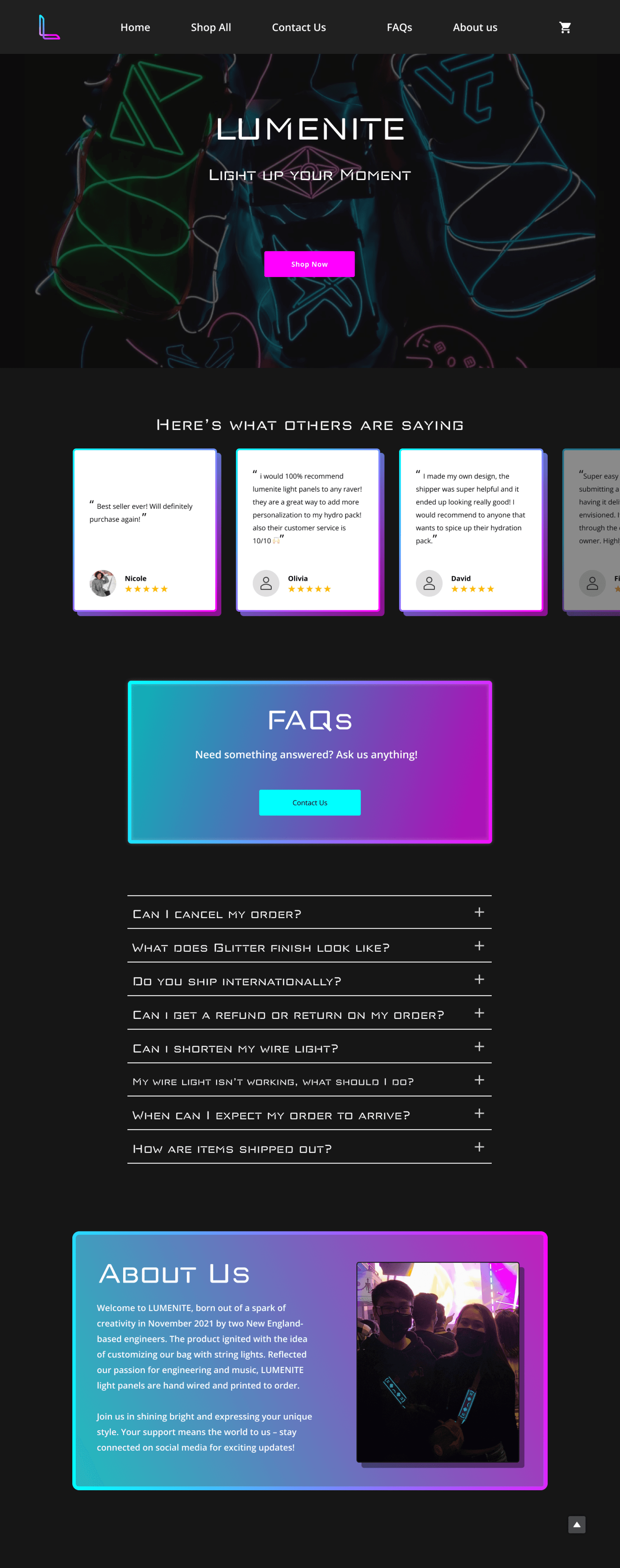
  • About, FAQs and newly added user reviews are now on the Home page.

  • FAQs in a drop-down form on the home page instead of its own separate page.

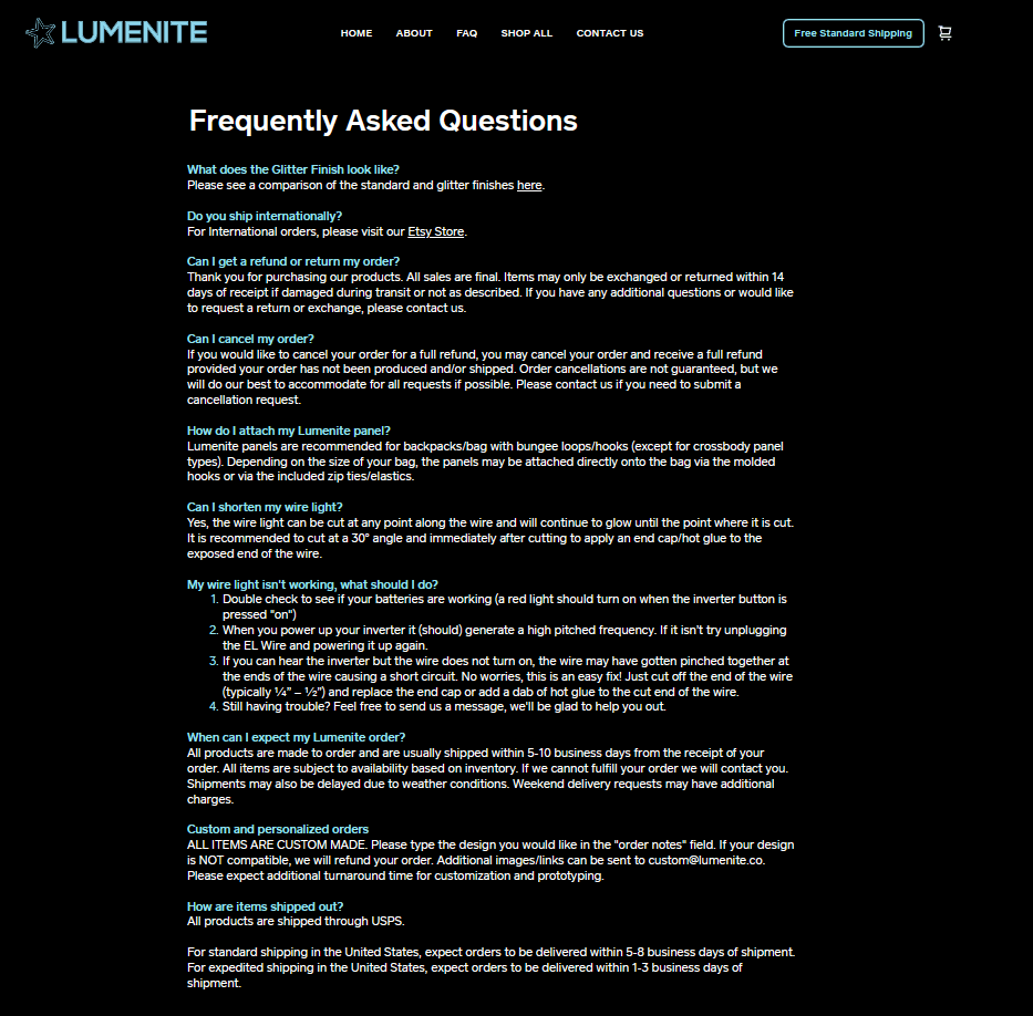
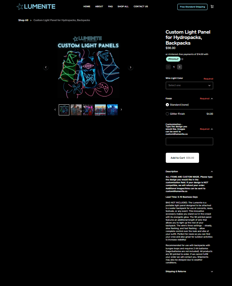
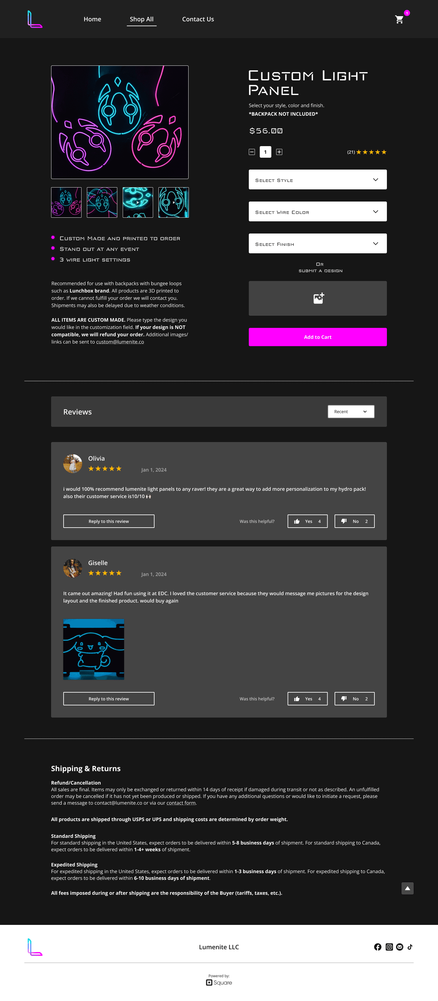
  • Shopping page UI was cleaned up and made so that it is a single-item shop with multiple options to choose from in the dropdown bars.

    • Users can select their style, wire colors and finish, or choose a custom print by submitting a design.

  • A review section was also added below the product selection.

  • Contact form was added within the webpage in which users can submit any questions or concerns they may have with their products, which will be responded to and taken care of through email.

Prior to this redesign payments were processed, and will continue to be processed through third-party payment application: Square.

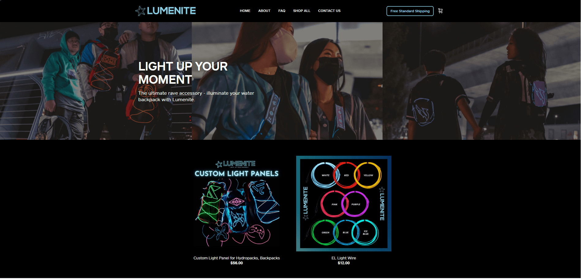
Old Lumenite Design

New Lumenite Design

Home Page

FAQs page

About Us page

Shopping Page

Home page

Shopping Page

Brand Identity

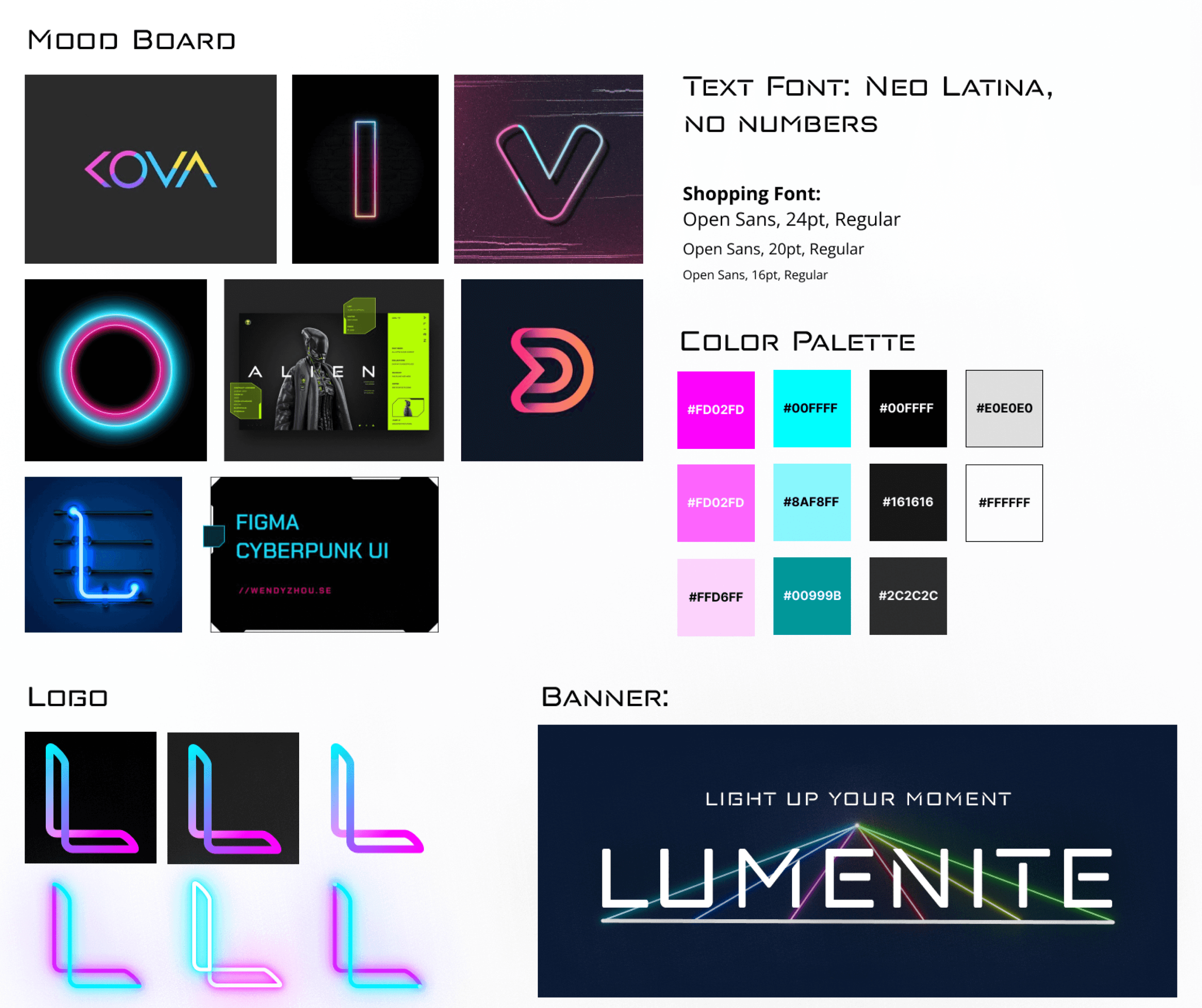
With the relaunch and redesign of Lumenite, we stuck with a neon-themed color palette and a tech/futuristic feel. With a darker base theme, the more vibrant colors were allowed to stand out, similar to how the light panels stand out in a festival crowd.

Usability Testing

I created a single round usability test using Maze.co for users to test two prototype pathways: item checkout/payment and submitting a contact form.


Users completed the tests and provided their thoughts and suggestions on what they would like to see added. While 93% of users found no issues and had no suggestions, 56% of users could not complete the first test due to desktop-to-mobile incompatibilities when taking the test.

Iterations

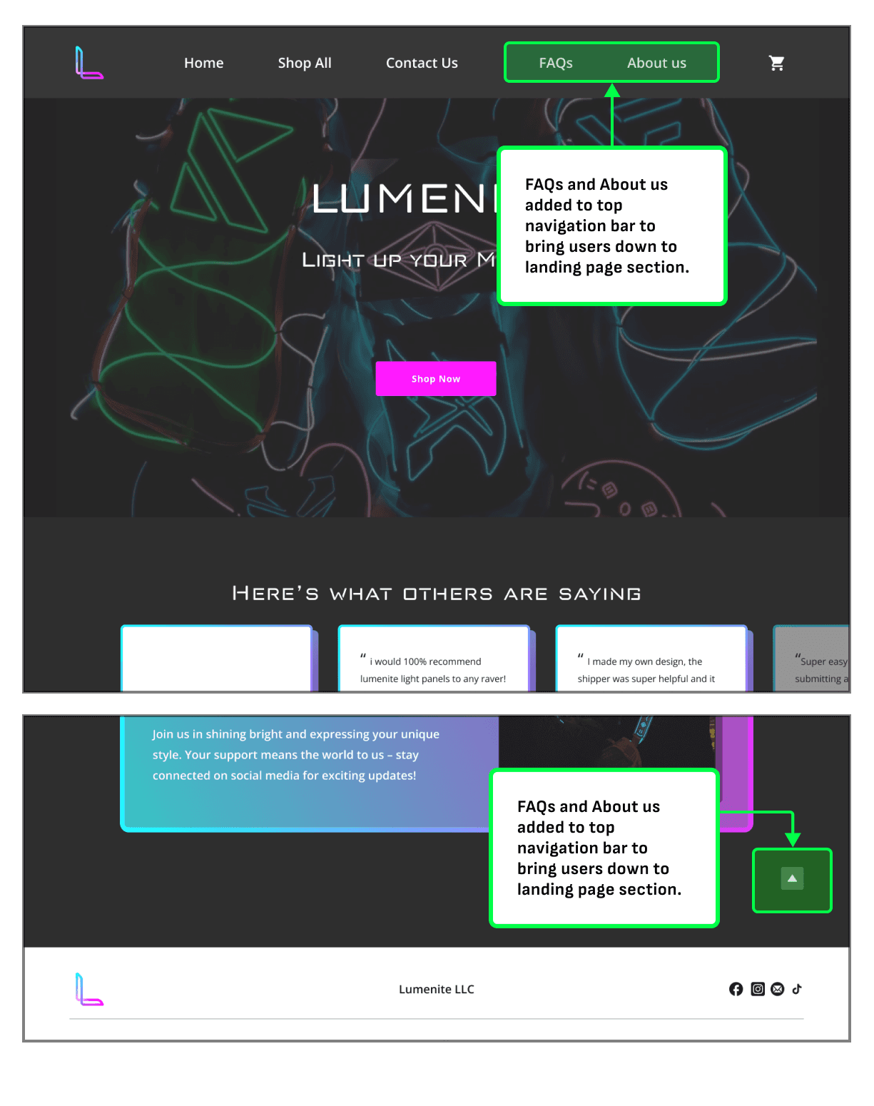
Based on the usability testing, users found it would be helpful to have buttons for the 'About' and 'FAQs' that would bring them to the section without having to scroll down too far. Currently, payments are processed via Square, a third party payment company. The Square purchase confirmation was added in the prototyping to show how the purchase is processed, after which the user will be redirected to the home page.

"FAQs" and "About us" added to quickly bring users down to the respective section.

Final Product

Key Learnings

First time working with clients has been an insightful experience as it gave me a higher sense of urgency and had me focus more on time management and clear communication. On the user side of communication, I gained a better understanding of user testing methods and how to better communicate my intentions to obtain better and more accurate data for iterations and improvements. Next time, I would specify with users whether the tests are for desktop or mobile.

Next Steps

With the main design changes made, hand-off to a developer is the next stage to complete the redesign. Further iterations and changes can also be added with time. I am still in contact with Lumenite owners to discuss any further iterations they would like and proceeding with the handoff when a developer is contacted.


Currently, Lumenite has temporarily made changes to their site until a developer is in contact for the design hand-off.