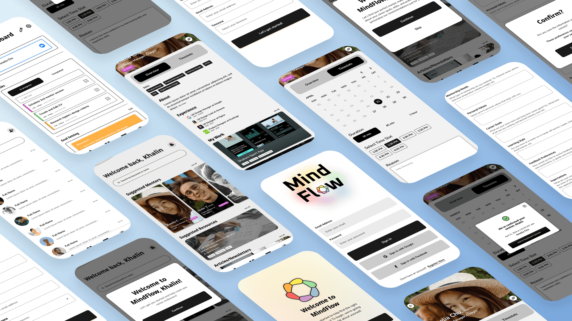
MindFlow

AI Mentor matcher for career development

Timeline: 4-5 weeks

Role: Product Designer/Manager, UX Researcher

Objective: Create an end-to-end mobile app MVP

Tools: Figma, Maze

MindFlow

AI Mentor matcher for career development

Timeline: 4-5 weeks

Role: Product Designer/Manager, UX Researcher

Objective: Create an end-to-end mobile app MVP

Tools: Figma, Maze

MindFlow

AI Mentor matcher for career development

Timeline: 4-5 weeks

Role: Product Designer/Manager, UX Researcher

Objective: Create an end-to-end mobile app MVP

Tools: Figma, Maze

MindFlow

AI Mentor matcher for career development

Timeline: 4-5 weeks

Role: Product Designer/Manager, UX Researcher

Objective: Create an end-to-end mobile app MVP

Tools: Figma, Maze

MindFlow

AI Mentor matcher for career development

Timeline: 4-5 weeks

Role: Product Designer/Manager, UX Researcher

Objective: Create an end-to-end mobile app MVP

Tools: Figma, Maze

Overview

With the difficulty of job searching reaching an all time high, so has people’s frustrations. We want to be able to help those who feel like they are struggling in looking for a job by providing the all-in-one help and resource platform they need to gain confidence in their career endeavors.

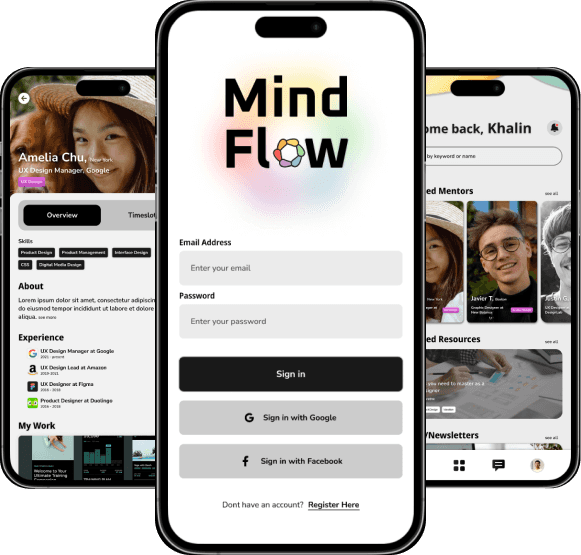
MindFlow is an AI-driven mentor pairing app that matches users with suitable mentors based on their background and interests. Users can view available mentors aligned with their job-seeking goals, schedule sessions, and gain advice and insights on their career paths.

We will dive into the design process of ideating and designing this Minimum Viable Product (MVP).

Problem

In today's competitive job market, the challenges of job searching and interviewing have become increasingly difficulty and daunting, leading to frustrations among job seekers. 

Solution

Our goal is to create an all-in-one resource and platform that helps users find suitable mentors to equip them with the tools, knowledge, and support they need to secure and excel in their career endeavors. 
My Design Process

DISCOVER

User Research, Research Findings, Competitive Analysis

Understanding the User:

In order to create a mentorship app that successfully tackles the challenges job seekers face when seeking interview preparation guidance, the app should include functionality for conducting user screenings. This feature will enable AI to suggest mentors more accurately, matching them with suitable users.

Goals

  • Understand why people would seek mentorship for their career journeys

  • Learn how AI can be implemented to match users with suitable mentors based on their preferences and needs.

  • Understand how AI can help users effectively match with mentors and the problems that may arise with this approach

Objectives

  • User interviews to gather insights into the challenges job seekers face.

  • Ideate and prioritize core features and functionalities for the mentorship-focused career preparation app based on user feedback.

  • Develop wireframes and prototypes for the app UI, incorporating user testing to ensure usability and effectiveness.

User Interviews

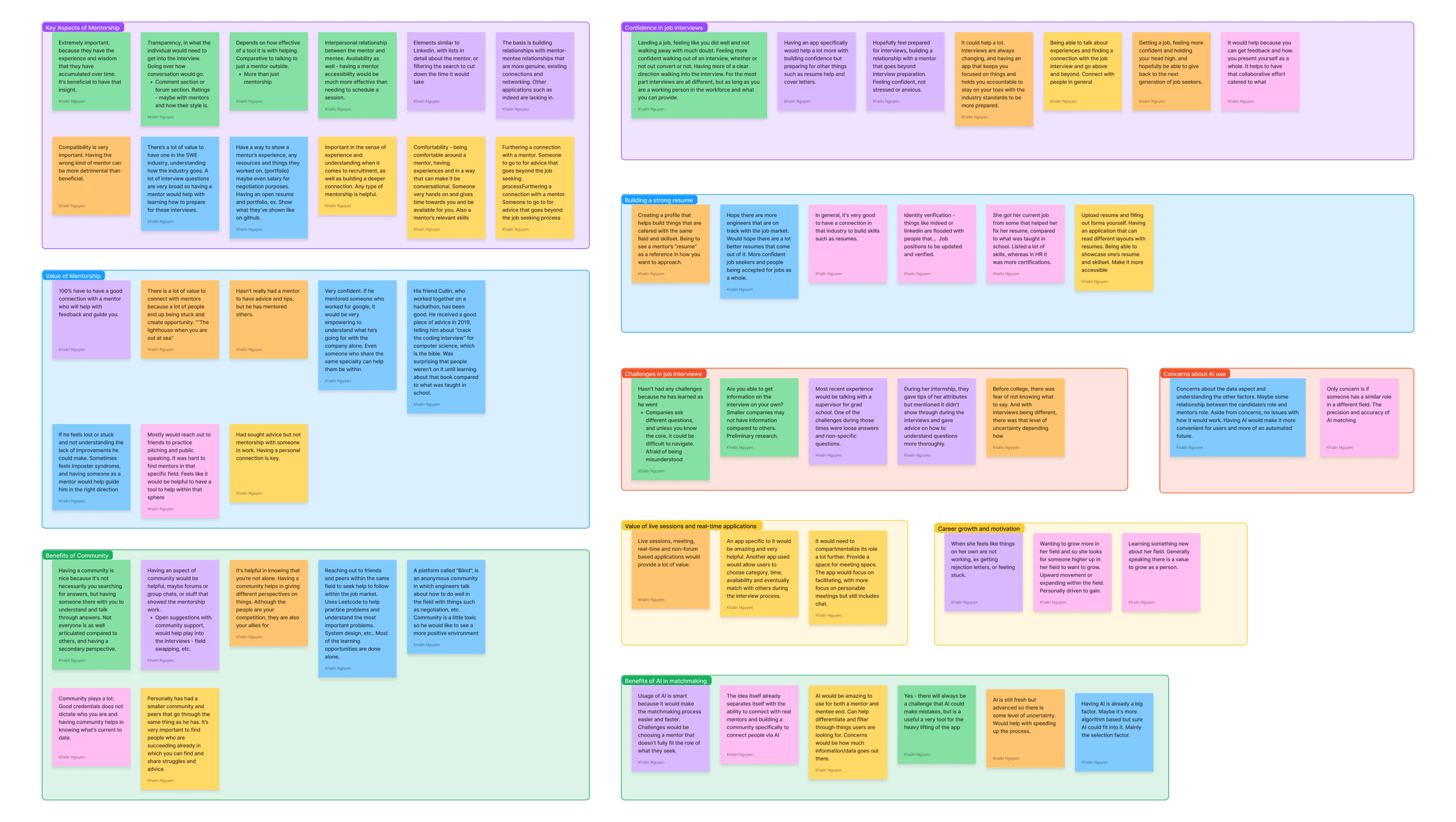
A single round of user interview showcased various points brought to attention by 6 participants of varying background and experience with mentorship and job seeking, revealing the following topics and insights:

  • Importance of Mentorship

  • Community

  • Job seeking challenges 

  • AI use and concerns

  • Hope-to-gain and suggestions

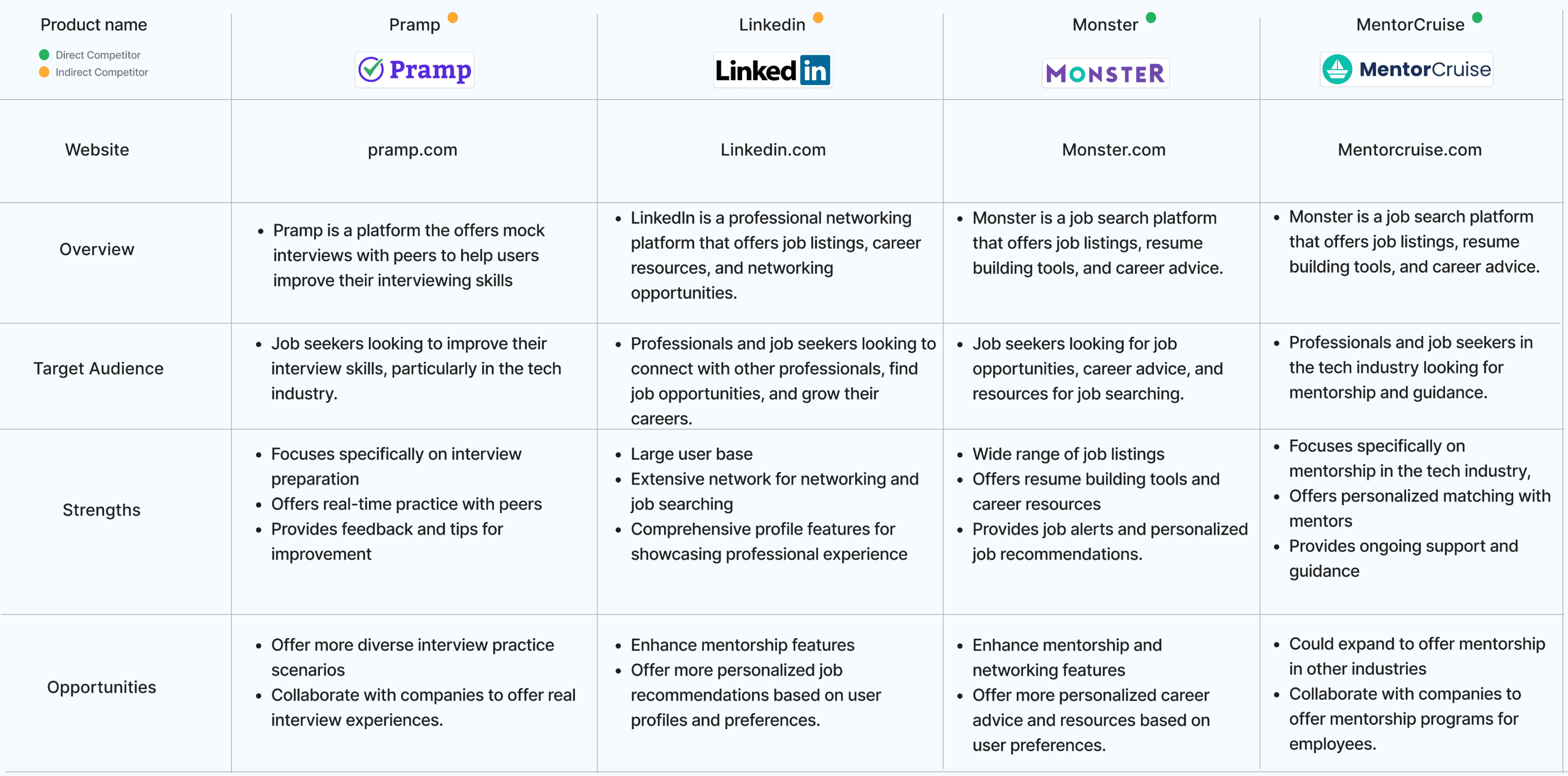
Competitive Analysis

With a simple competitor analysis we take a look at four competitors (direct & indirect) and compare their strengths and the opportunities presented by them:

IDEATION

User Personas, User Goals, Information Architecture

User Personas, User Goals, Information Architecture

Ideation

Early stage ideation began with our knowing what we wanted to include based on our personas. I started by laying out business and user goals, a list of features, and sitemaps. Differentiating the product and user goals helped me better understand the design goals and how to proceed through the ideation process.

Early stage ideation began with our knowing what we wanted to include based on our personas. I started by laying out business and user goals, a list of features, and sitemaps. Differentiating the product and user goals helped me better understand the design goals and how to proceed through the ideation process.

This MVP’s features are as follows:

  • User onboarding to match users with mentors aligned with their line of work and skills

  • Selecting a mentor and view their work & experience

  • Scheduling sessions with potential mentors

  • Basic view of user dashboards

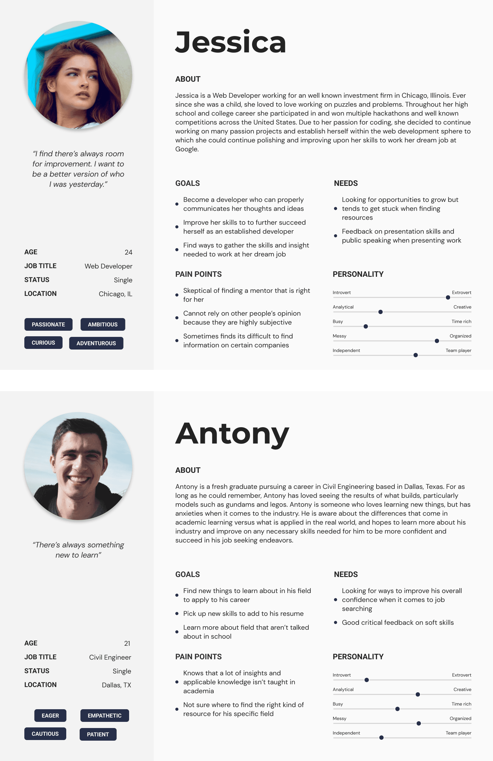
Personas

With various responses from the user interviews, we based our personas on the different goals, needs, pain points and degrees of confidence to gauge the types of users our product would attract.

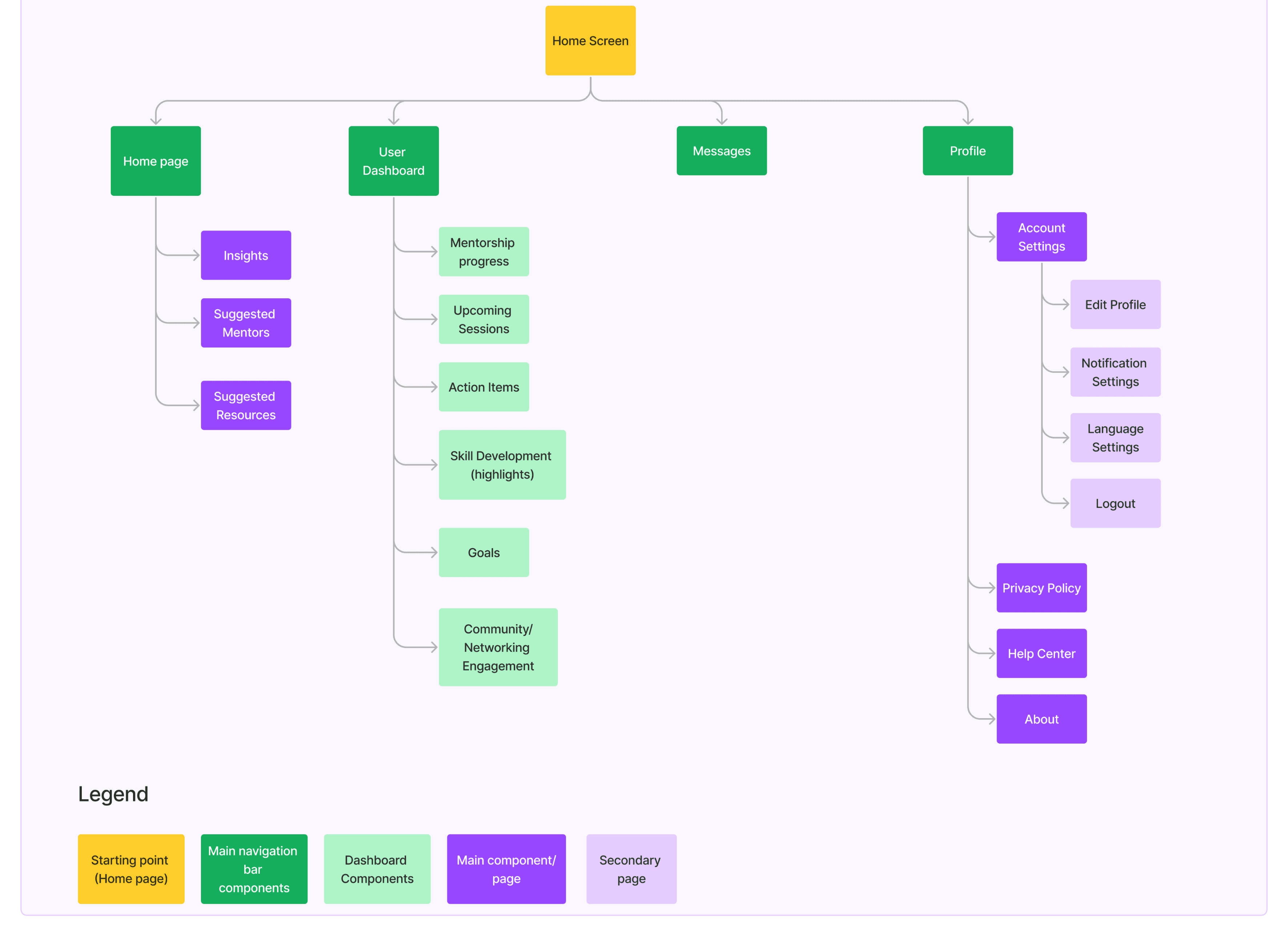
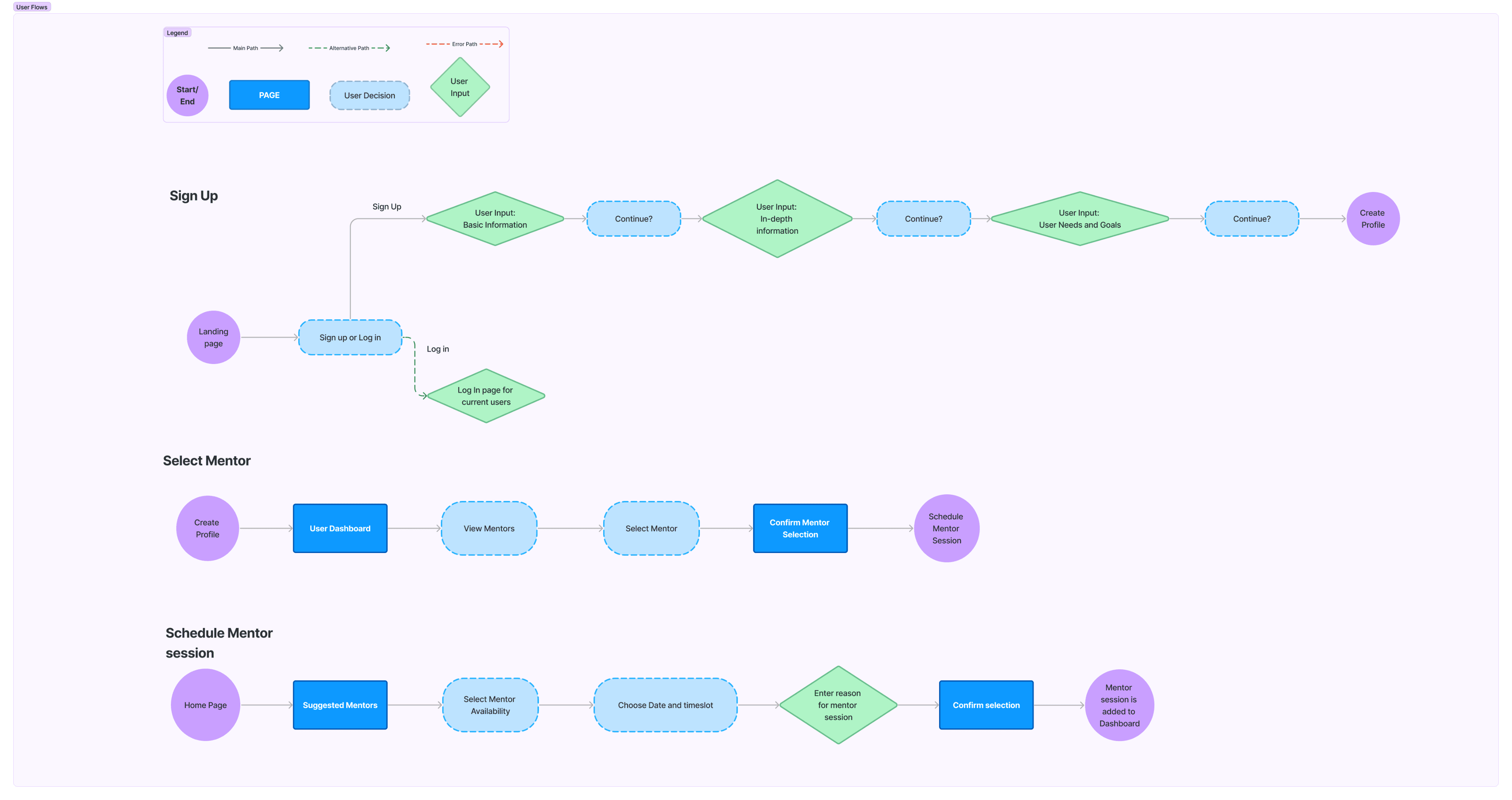
Sitemap and User Flows

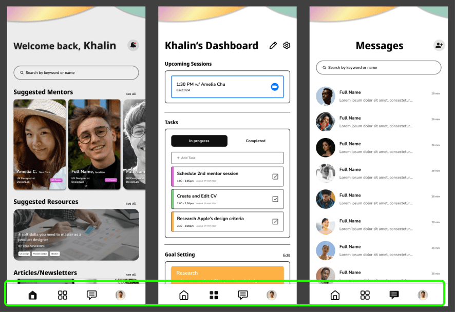
A simple site-map and user flow to focus on the onboarding sections to better pair users with the best mentors to choose from, and scheduling sessions available sessions with mentors. The homepage to show users content suggested to them based on the onboarding process such as suggested mentors, resources and articles. A dashboard section for users to view, track and note their career journeys.

A simple site-map and user flow to focus on the onboarding sections to better pair users with the best mentors to choose from, and scheduling sessions available sessions with mentors. The homepage to show users content suggested to them based on the onboarding process such as suggested mentors, resources and articles. A dashboard section for users to view, track and note their career journeys.

A simple site-map and user flow to focus on the onboarding sections to better pair users with the best mentors to choose from, and scheduling sessions available sessions with mentors. The homepage to show users content suggested to them based on the onboarding process such as suggested mentors, resources and articles. A dashboard section for users to view, track and note their career journeys.

DESIGN

Sketches, Low to Hi-Fi Wireframes, Prototyping

Sketches & Digital Wireframes

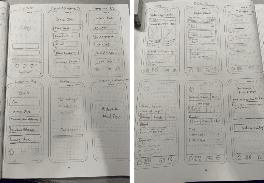
The initial set of low fidelity sketches were translated to mid fidelity digital wireframes using Figma. The Mid-Fi wireframes were brought to life with carefully crafted design system and brand design.

The initial set of low fidelity sketches were translated to mid fidelity digital wireframes using Figma. The Mid-Fi wireframes were brought to life with carefully crafted design system and brand design.

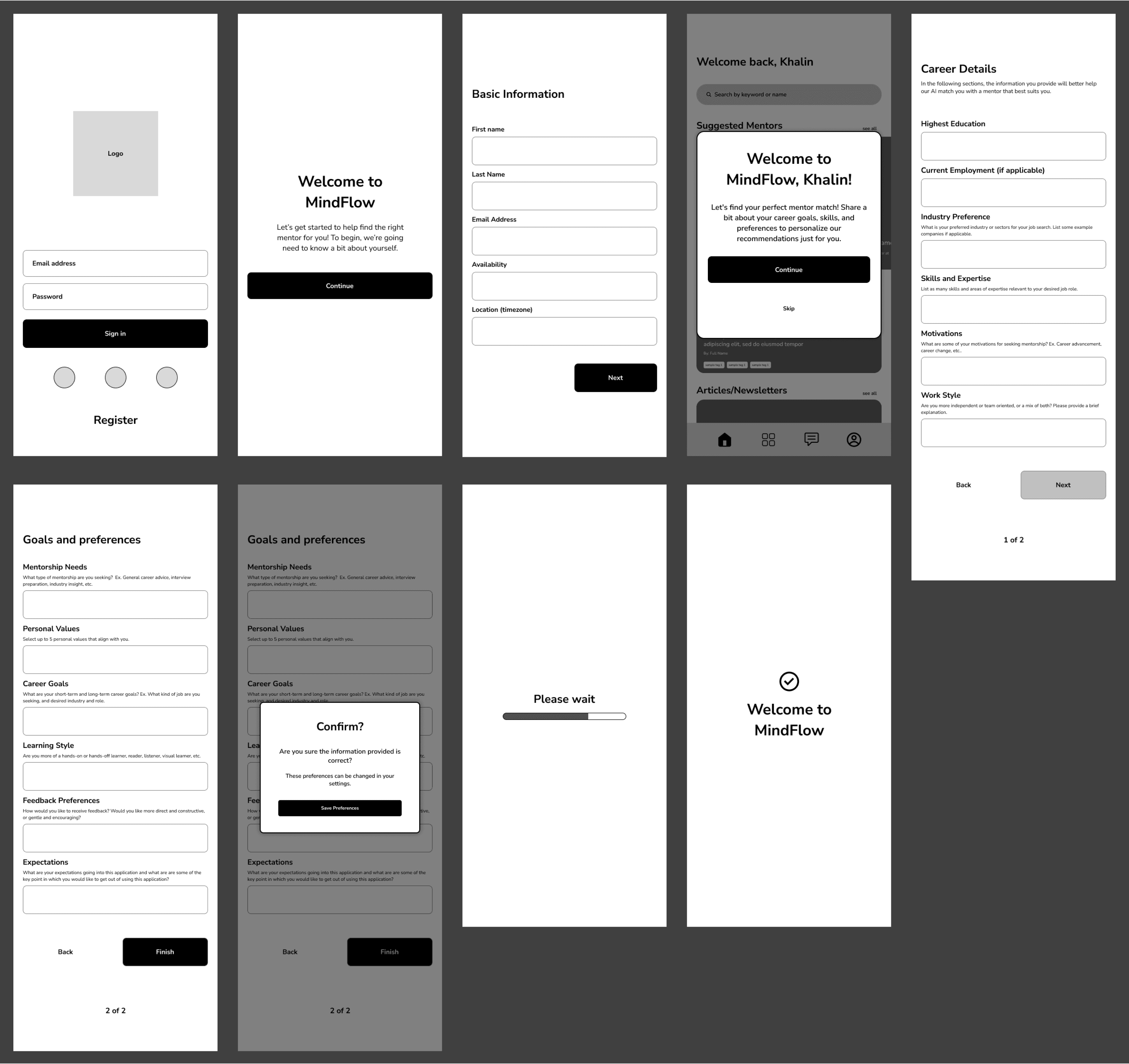
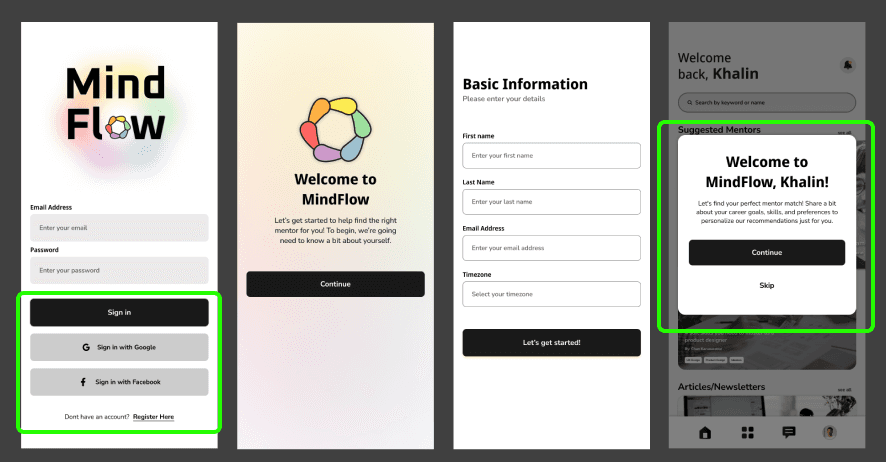
The low fidelity sketches set a benchmark as to how I envisioned the app to be thought through and turned them into mid fidelity digital wireframes. After a few rounds of iterations upon peer feedback and suggestions, the MindFlow wireframe adjustments were made on the UI principles and user convenience, such as adding a modal to allow users to skip the initial screening process if they wished to continue at a later time.

The low fidelity sketches set a benchmark as to how I envisioned the app to be thought through and turned them into mid fidelity digital wireframes. After a few rounds of iterations upon peer feedback and suggestions, the MindFlow wireframe adjustments were made on the UI principles and user convenience, such as adding a modal to allow users to skip the initial screening process if they wished to continue at a later time.

Digital Wireframes

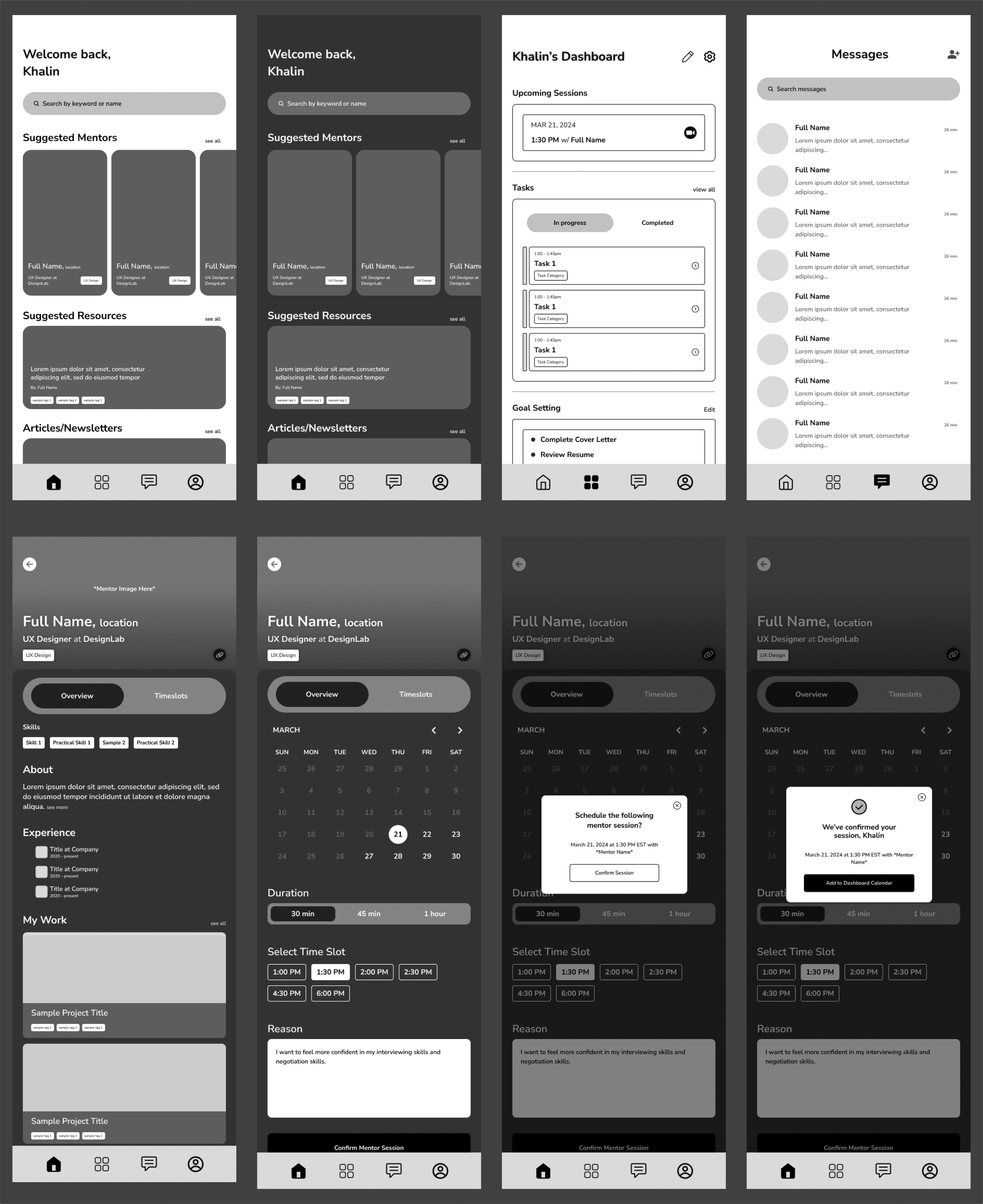
The initial set of low fidelity sketches were translated to mid fidelity digital wireframes using Figma. The Mid-Fi wireframes were brought to life with carefully crafted design system and brand design.

The initial set of low fidelity sketches were translated to mid fidelity digital wireframes using Figma. The Mid-Fi wireframes were brought to life with carefully crafted design system and brand design.

Onboarding Section:

Main Screens:

Brand Identity

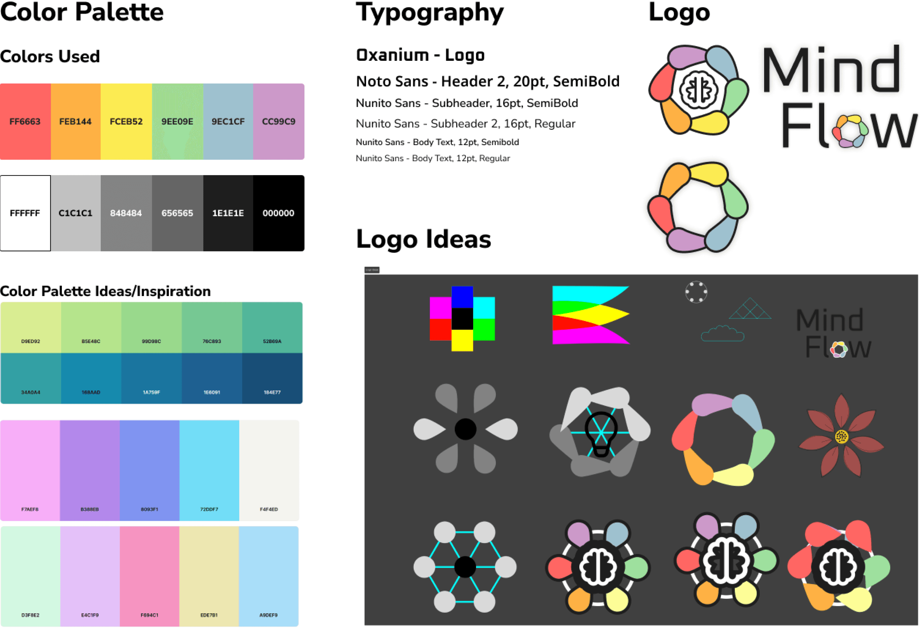
I chose a neutral color palette with white and black for the main colors. With majority of the imagery coming from profile pictures and online article/resources images, keeping main colors neutral and accenting them with softer rainbow/pastel colors would give users a more approachable and welcoming feel.

I chose a neutral color palette with white and black for the main colors. With majority of the imagery coming from profile pictures and online article/resources images, keeping main colors neutral and accenting them with softer rainbow/pastel colors would give users a more approachable and welcoming feel.

Usability Testing

I created a single round usability test study using Maze.co for users to test two prototype pathways:

  • User onboarding and screening

  • Scheduling a mentor session

Users completed the tests and provided their thoughts and suggestions on what they would like to see added. Although there was some initial confusion users had about the tasks due to a minor lack of detail in the protocol’s description which increased the misclick rate, 100% of users completed the tasks with little to no suggestion or complaints.

Iterations

Iterations made were minor adjustments such as highlighting the tabs users were currently on in the main screens, and some changes to the onboarding section that better applied UI principles such as corner more consistent corner rounding and text sizing.

Iterations made were minor adjustments such as highlighting the tabs users were currently on in the main screens, and some changes to the onboarding section that better applied UI principles such as corner more consistent corner rounding and text sizing.

Final Product:

Onboarding:

Scheduling:

Key Learnings

Minimum Viable Products

One of the key learnings from this project is the ability to create an MVP effectively by limiting the app's features. I learned the importance of preserving the integrity of an MVP by focusing solely on essential core features and functionalities.


Additionally, managing scope and avoiding focus creep were crucial. Simplifying the app required narrowing down the target audience and the app's overall purpose.

One of the key learnings from this project is the ability to create an MVP effectively by limiting the app's features. I learned the importance of preserving the integrity of an MVP by focusing solely on essential core features and functionalities.

Additionally, managing scope and avoiding focus creep were crucial. Simplifying the app required narrowing down the target audience and the app's overall purpose.

AI Utilization

The utilization of AI can be both straightforward and complex, depending on its application. In the context of MindFlow, we explore how user onboarding/screening can offer suggested mentors, but the process is more intricate than it appears. Understanding the nuances of AI operation and its potential impact on a product is crucial and obtaining a deeper knowledge and understanding about the evolving AI industry is essential to effectively utilize it in the design world.
Next Steps

The next steps I would like to take for this product is extend it beyond an MVP. I think this problem users face is a serious challenge especially in 2024 as the job market continues to difficult to predict. The first steps would be to hand off to a developer to create the MVP with the current features and functionalities present.


Following that would be to extend the product beyond an MVP and add more functionalities to the already existing features, such as completing the dashboard components and the ability to edit one’s dashboard. Finally adding more features that are nice to have such as a community forum to connect users, or further utilize AI by implementing an AI-driven resume checker.

The next steps I would like to take for this product is extend it beyond an MVP. I think this problem users face is a serious challenge especially in 2024 as the job market continues to difficult to predict. The first steps would be to hand off to a developer to create the MVP with the current features and functionalities present.

Following that would be to extend the product beyond an MVP and add more functionalities to the already existing features, such as completing the dashboard components and the ability to edit one’s dashboard. Finally adding more features that are nice to have such as a community forum to connect users, or further utilize AI by implementing an AI-driven resume checker.